
Repository
https://github.com/ajayyy/SponsorBlock
Invidious support
Challenges
The extension only has permission to view the YouTube domain, and adding permissions causes the extension to automatically be disabled for all users. So, I had to make it an option and use Chrome's optional permissions API.
Optional Content Scripts
The harder part to do is optional content scripts. The API to do this is considered "expiremental" in chrome, even though it has been around for years.
I works very similarity to registering a content script in the manifest, but can be done programmatically. All you need is the specific site permission. The catch is that it is not perfect. For example, it just doesn't work in incongnito for some reason. There is no documentation saying this and their excuse is that it is "expiremental" and should not be used in production code, even though it is the only way to do this.
The only alternative is to use the tabs permission, and read every URL visited to see if it is the one you want. If found, you can executeScript() on that page. Not only is this less effecient, but it requires the scary tabs permission which tells the user that you can read the user's browsing history. I may revert to this technique in the future as an "Advanced Mode" that supports Incognito tabs.
This API is not available in Firefox, which instead uses a different API. This API automatically unregisters your content script on restart. To prevent this, you must reregister it after every restart in the background script. This is pretty simple to use.
UI Support
Thankfully, Afrmtbl made a PR to add the UI support, so I didn't need to do that.
Final Result
You can now enable invidious support in the options by clicking the toggle and accepting the extra permissions. If you disable it at a later point, the extension will remove the permissions from itself as well, so it never has too many permissions.
Options Page
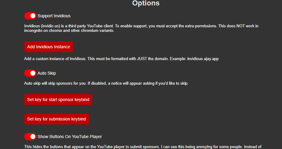
The way options used to be handled was terrible.
There were just a bunch of buttons in the popup that changed their text when you toggled them.
It now is a list of toggle boxes and buttons that use a consistent feel.
Not only does this look nicer, it also is cleaner in the code. The options are now handled by one function that scans the HTML. It reads the attributes of the divs to determine what the option should toggle.
In the HTML, the option toggles look like this:
<div option-type="toggle" toggle-type="reverse" sync-option="disableAutoSkip">
<label class="switch-container" label-name="__MSG_autoSkip__">
<label class="switch">
<input type="checkbox" checked>
<span class="slider round"></span>
</label>
</label>
<br/>
<br/>
<div class="small-description">__MSG_autoSkipDescription__</div>
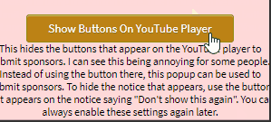
</div>It will change what option changes using the sync-option attribute. The toggle-type attribute is used if the option is reversed. For example, when disableAutoSkip is true, this switch should show false, as it is called "Auto Skip".
This makes it easy to add new options.
Text change type
<div option-type="text-change" sync-option="userID" confirm-message="userIDChangeWarning">
	<div class="option-button trigger-button">
		__MSG_changeUserID__
	</div>

	<br/>

	<div class="small-description">__MSG_whatChangeUserID__</div>

	<div class="option-hidden-section hidden">
		<br/>

		<input class="option-text-box" type="text">

		<br/>
		<br/>

		<div class="option-button text-change-set">
			__MSG_setUserID__
		</div>
	</div>
</div>
This one is similar. The option-type is now text-change. The confirm-message specifies what message should be displayed on the confirmation box before the options is set. This can be omitted if you do not need it.
<div option-type="keybind-change" sync-option="startSponsorKeybind">
	<div class="option-button trigger-button">
		__MSG_setStartSponsorShortcut__
	</div>

	<div class="option-hidden-section hidden">
		<br/>

		<div class="medium-description keybind-status">
			__MSG_keybindDescription__
		</div>

		<span class="medium-description bold keybind-status-key">

		</span>
	</div>
</div>
This option will ask the user to click a key. The clicked key will be saved in sync-option.
Using these
When using these, copy one of the other ones and change the parameters. The other divs inside are needed for it to work, as the JavaScript only hides divs or changes text.
How it works
for (let i = 0; i < optionsElements.length; i++) {
    switch (optionsElements[i].getAttribute("option-type")) {
        case "toggle":
            let option = optionsElements[i].getAttribute("sync-option");
            let optionResult = SB.config[option];

            let checkbox = optionsElements[i].querySelector("input");
            let reverse = optionsElements[i].getAttribute("toggle-type") === "reverse";

            if (optionResult != undefined) {
                checkbox.checked = optionResult;

                if (reverse) {
                    optionsElements[i].querySelector("input").checked = !optionResult;
                }
            }

            // See if anything extra should be run first time
            switch (option) {
                case "supportInvidious":
                    invidiousInit(checkbox, option);
                    break;
            }

            // Add click listener
            checkbox.addEventListener("click", () => {
                SB.config[option] = reverse ? !checkbox.checked : checkbox.checked;

                // See if anything extra must be run
                switch (option) {
                    case "supportInvidious":
                        invidiousOnClick(checkbox, option);
                        break;
                }
            });
            break;
        case "text-change":
            let button = optionsElements[i].querySelector(".trigger-button");
            button.addEventListener("click", () => activateTextChange(optionsElements[i]));

            let textChangeOption = optionsElements[i].getAttribute("sync-option");
            // See if anything extra must be done
            switch (textChangeOption) {
                case "invidiousInstances":
                    invidiousInstanceAddInit(optionsElements[i], textChangeOption);
            }

            break;
        case "keybind-change":
            let keybindButton = optionsElements[i].querySelector(".trigger-button");
            keybindButton.addEventListener("click", () => activateKeybindChange(optionsElements[i]));

            break;
        case "display":
            updateDisplayElement(optionsElements[i])
    }
}
Depending on the option-type, a different switch case will be triggered. For the toggle type, it simply sets up a click listener and will change the option accordingly. It will also make sure to set the checkbox to the right position at the start.
The "See if anything extra should be run first time" allow for custom option types to be created. In these switch statements, code specific to one option can be added. For example, this is how all of the Invidious Support code is run while keeping the checkbox still bound by all of the normal rules.